The people feeling this the most were product designers
They would finish their work but couldn’t ship because visuals were still in production. Illustrators had to conceptualize the visual, produce it, and then go through rounds of feedback and iteration.
With only two illustrators supporting more than twenty-five designers, requests piled up quickly. Each illustration typically took four to seven days to conceptualise, produce, and refine. During peak delivery periods, entire features were ready to ship but the visuals were not.

It felt like running a restaurant for an entire city with only two chefs in the kitchen.
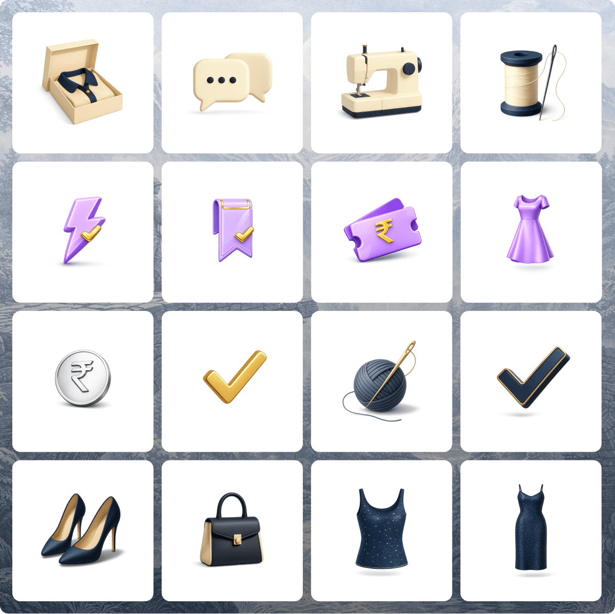
I experienced this bottleneck firsthand while working on a customisation flow for Indian wear Luxe products. The experience involved several steps and required visuals to guide users instead of relying on dense blocks of text. At the same time, the feature was strongly driven by business priorities, which meant tight timelines and constant pressure from product and business stakeholders.
Waiting for illustration bandwidth was not an option.
So I tried something unusual.
Instead of submitting a request, I attempted to mimic the existing illustration style myself. To my surprise, it worked. But that experiment revealed something else. The illustration language we were using had not evolved in a while.
What started as a workaround quickly turned into a bigger realization.
The problem wasn’t just illustrator capacity.
The real issue was that designers had no system that allowed them to create illustrations themselves while maintaining consistency. There was a visual language in place, but it wasn’t encoded into a usable framework.
At the same time, AI-driven image generation was rapidly evolving. Designers across the industry were experimenting with these tools. But the outputs had two major limitations for product use: they struggled with stylistic consistency, and they rarely produced clean transparent PNG assets, which were non-negotiable for product interfaces that used varying backgrounds and contexts.
Still, the potential was clear.
If our illustration language could be translated into a structured system, designers could generate visuals themselves while staying aligned to the product’s visual identity.
I began translating the illustration style into a set of structured visual components.
Every element of the illustration system was defined. Colours, forms, lighting, shadows, proportions, surface finishes, and textures. Instead of treating each illustration as a custom artwork, the style was broken down into rules.
Those rules became the genesis of the system.
To ensure consistency, the system was encoded into a JSON-based context, which served as the foundation for generating visuals in the defined style. This context was then used to build a custom GPT workflow that designers could use to generate product illustrations.
You are a Senior Visual Illustrator.

Task: Create a premium realistic miniature illustration of [INSERT OBJECT HERE].

Workflow:
   1.    First, generate a detailed plan for the illustration. The plan must cover:
   •    Geometry & forms (based on JSON context)
   •    Scale & proportions
   •    Lighting & shadows
   •    Textures & material finish
   •    Palette usage with tints & shades for depth
   •    Composition & mood
   2.    Present the plan and wait for confirmation.
   3.    Only after confirmation, generate the illustration with these rules:
   •    Transparent background
   •    Preserve a soft, defined elliptical contact shadow below the object (shadow should fade naturally into transparency, not get cut off).
   •    Ensure the object stays minimal, pristine, and premium per the JSON context.

JSON Context for Consistency:

{
"style_name": "Premium Realistic Miniature",
"summary": "Clean, modern miniature objects with refined premium finishes. Proportions are simplified but elegant, surfaces are satin to semi-matte, lighting is soft directional, and edges are crisp with subtle bevels.",

"forms": {
"geometry": "Streamlined realistic; smooth planes with subtle bevels and crisp edges.",
"scale": "Hero object occupies 70–85% of canvas height.",
"perspective": "Orthographic or very shallow perspective for premium product presentation.",
"orientation": "Always front-facing or slightly rotated towards the right (≤15°).",
"proportions": "Close to real objects, with subtle emphasis for readability."
},

"lighting": {
"environment": "Soft directional studio lighting with gentle contrast.",
"direction": "Always from the top-left at a 30–45° angle, defining form and depth.",
"shadows": "Defined elliptical contact shadow; soft falloff, preserved over transparency.",
"highlights": "Subtle reflective highlights; avoid harsh glare."
},

"textures": {
"material_finish": "Satin to semi-matte with refined micro-detail.",
"details": "Hints of brushed metal, fine weave, or polished edges used sparingly.",
"imperfections": "Minimal; overall pristine and premium."
},

"canvas": {
"aspect_ratio": "1:1",
"background": "Transparent",
"ground_contact": "Premium elliptical shadow that fades naturally into transparency"
},

"palette": {
"navy": { "base": "#001325", "tint-20": "#334354", "tint-40": "#667383", "tint-60": "#99A2B1", "tint-80": "#CCD1D0", "shade-10": "#00101F", "shade-20": "#000D19", "shade-30": "#000A13", "a-10": "rgba(0,19,37,0.1)", "a-20": "rgba(0,19,37,0.2)", "a-40": "rgba(0,19,37,0.4)", "a-60": "rgba(0,19,37,0.6)" },
"dutchwhite": { "base": "#F3DFBA", "tint-20": "#F6E5C8", "tint-40": "#F9ECD7", "tint-60": "#FBF3E6", "tint-80": "#FDF9F3", "shade-10": "#DBC9A7", "shade-20": "#C2B294" },
"papayawhip": { "base": "#FFEAC8", "tint-20": "#FFF0D9", "tint-40": "#FFF5E5", "tint-60": "#FFF9F0", "tint-80": "#FFFCF8", "shade-10": "#E6D3B4", "shade-20": "#CCBCA0" },
"cornsilk": { "base": "#FFF3D6", "tint-20": "#FFF6E0", "tint-40": "#FFF9EB", "tint-60": "#FFFBF2", "tint-80": "#FFFDF9", "shade-10": "#E6DBC1", "shade-20": "#CCC3AD" },
"amaranth": { "base": "#C42163", "tint-20": "#D04D82", "tint-40": "#DB79A1", "tint-60": "#E6A6C1", "tint-80": "#F2D2E0", "shade-10": "#B11E59", "shade-20": "#9D1A4F" },
"gold": { "base": "#D4AF37", "tint-20": "#DCBF63", "tint-40": "#E3CF8F", "tint-60": "#EBDDB5", "tint-80": "#F3EDD9", "shade-10": "#BE9D32", "shade-20": "#A78A2C" }
},

"usage_rules": {
"base_ratio": "Neutrals (Dutch White, Papaya Whip, Cornsilk) ~60% of surface.",
"secondary_ratio": "Navy family (navy + its tints/shades) 20–30% for structure and depth.",
"accent_ratio": "Amaranth or Gold ≤ 5–10% total. Prefer trims, dots, ticks.",
"variant_rules": [
"Tints/shades count toward their parent family ratio.",
"Use ≤ 2 variants per family in one illustration.",
"For small details, prefer base navy or navy/tint-20 for contrast.",
"Gold: avoid dark shades; rely on highlights and trims.",
"Always use tints and shades of base colors to create depth, dimension, and premium realism (never flat fills across entire surfaces)."
]
}
}
You are a Senior Visual Illustrator.
Task: Create a premium realistic miniature illustration of [INSERT OBJECT HERE].
Workflow:
1. First, generate a detailed plan for the illustration. The plan must cover:
• Geometry & forms (based on JSON context)
• Scale & proportions
• Lighting & shadows
• Textures & material finish
• Palette usage with tints & shades for depth
• Composition & mood
2. Present the plan and wait for confirmation.
3. Only after confirmation, generate the illustration with these rules:
• Transparent background
• Preserve a soft, defined elliptical contact shadow below the object (shadow should fade naturally into transparency, not get cut off).
• Ensure the object stays minimal, pristine, and premium per the JSON context.
JSON Context for Consistency:
{
"style_name": "Premium Realistic Miniature",
"summary": "Clean, modern miniature objects with refined premium finishes. Proportions are simplified but elegant, surfaces are satin to semi-matte, lighting is soft directional, and edges are crisp with subtle bevels.",
"forms": {
"geometry": "Streamlined realistic; smooth planes with subtle bevels and crisp edges.",
"scale": "Hero object occupies 70–85% of canvas height.",
"perspective": "Orthographic or very shallow perspective for premium product presentation.",
"orientation": "Always front-facing or slightly rotated towards the right (≤15°).",
"proportions": "Close to real objects, with subtle emphasis for readability."
},
"lighting": {
"environment": "Soft directional studio lighting with gentle contrast.",
"direction": "Always from the top-left at a 30–45° angle, defining form and depth.",
"shadows": "Defined elliptical contact shadow; soft falloff, preserved over transparency.",
"highlights": "Subtle reflective highlights; avoid harsh glare."
},
"textures": {
"material_finish": "Satin to semi-matte with refined micro-detail.",
"details": "Hints of brushed metal, fine weave, or polished edges used sparingly.",
"imperfections": "Minimal; overall pristine and premium."
},
"canvas": {
"aspect_ratio": "1:1",
"background": "Transparent",
"ground_contact": "Premium elliptical shadow that fades naturally into transparency"
},
"palette": {
"navy": { "base": "#001325", "tint-20": "#334354", "tint-40": "#667383", "tint-60": "#99A2B1", "tint-80": "#CCD1D0", "shade-10": "#00101F", "shade-20": "#000D19", "shade-30": "#000A13", "a-10": "rgba(0,19,37,0.1)", "a-20": "rgba(0,19,37,0.2)", "a-40": "rgba(0,19,37,0.4)", "a-60": "rgba(0,19,37,0.6)" },
"dutchwhite": { "base": "#F3DFBA", "tint-20": "#F6E5C8", "tint-40": "#F9ECD7", "tint-60": "#FBF3E6", "tint-80": "#FDF9F3", "shade-10": "#DBC9A7", "shade-20": "#C2B294" },
"papayawhip": { "base": "#FFEAC8", "tint-20": "#FFF0D9", "tint-40": "#FFF5E5", "tint-60": "#FFF9F0", "tint-80": "#FFFCF8", "shade-10": "#E6D3B4", "shade-20": "#CCBCA0" },
"cornsilk": { "base": "#FFF3D6", "tint-20": "#FFF6E0", "tint-40": "#FFF9EB", "tint-60": "#FFFBF2", "tint-80": "#FFFDF9", "shade-10": "#E6DBC1", "shade-20": "#CCC3AD" },
"amaranth": { "base": "#C42163", "tint-20": "#D04D82", "tint-40": "#DB79A1", "tint-60": "#E6A6C1", "tint-80": "#F2D2E0", "shade-10": "#B11E59", "shade-20": "#9D1A4F" },
"gold": { "base": "#D4AF37", "tint-20": "#DCBF63", "tint-40": "#E3CF8F", "tint-60": "#EBDDB5", "tint-80": "#F3EDD9", "shade-10": "#BE9D32", "shade-20": "#A78A2C" }
},
"usage_rules": {
"base_ratio": "Neutrals (Dutch White, Papaya Whip, Cornsilk) ~60% of surface.",
"secondary_ratio": "Navy family (navy + its tints/shades) 20–30% for structure and depth.",
"accent_ratio": "Amaranth or Gold ≤ 5–10% total. Prefer trims, dots, ticks.",
"variant_rules": [
"Tints/shades count toward their parent family ratio.",
"Use ≤ 2 variants per family in one illustration.",
"For small details, prefer base navy or navy/tint-20 for contrast.",
"Gold: avoid dark shades; rely on highlights and trims.",
"Always use tints and shades of base colors to create depth, dimension, and premium realism (never flat fills across entire surfaces)."
]
}
}The workflow was designed to keep a human in the loop, ensuring both creativity and control.
A designer would begin by describing the illustration they needed or the product problem they wanted to visualize. If the request was problem-based, the system would suggest illustration concepts. If the designer already had a visual in mind, the system would explain exactly what it intended to generate and ask a few clarifying questions.
Once the designer confirmed the direction, the illustration would be generated.
This structured interaction dramatically reduced iteration cycles. Because the outputs were constrained by the style system, each generated visual remained aligned with the illustration language. Designers could now generate visuals that were stylistically consistent and ready to integrate into the product.
What once took several days could now happen in a fraction of the time.
The impact was immediate.
Illustration production became twenty times faster.
Designers were no longer entirely dependent on illustrator bandwidth to move forward with their work. I witnessed a moment that captured the shift perfectly. A feature required several product spot illustrations, but the illustrator’s style and timeline did not align with the delivery schedule.
Instead of waiting, the designer used the framework.
Within the same day, they generated five product spot illustrations that looked polished, on-brand, and visually cohesive. The feature shipped on time.
What once required days of coordination, iteration, and dependency could now happen in hours.
This project started as an attempt to remove a bottleneck, but it ended up creating something larger: a scalable illustration system.
By translating the visual language into structured rules and workflows, we enabled designers to produce consistent visuals without sacrificing quality or brand identity.
The work is still evolving.
I am currently exploring ways to make the process even simpler and easier to adopt across teams. One idea I am investigating is a plugin that understands screen and content context. Instead of designers describing the illustration manually, the tool could analyze the screen state, understand the UX scenario, and generate relevant illustration options aligned with the visual language.
The goal is to move toward a future where illustrations become a natural extension of the design system, rather than a bottleneck in product delivery.
Sometimes the fastest way to scale creative output is not by adding more people.
It is by designing the system differently.
