Low hanging fruits for serious impact: How I reduced Cart to PDP drop offs from 70% to 22%
The Problem
70% of users were abandoning their carts and going back to the Product Detail Page (PDP). This led to users getting back into the discovery loop and also resulted in delayed or lost conversions.
Our goal was to figure out the intent of the users and, through design intervention, solve this issue to reduce the drop-offs.
Research
Research involved desk research, diving deep into data, and speaking to users about their cart experience. Quick view was part of a bigger project, where I conducted extensive competitor analysis as well.
Part 1 of the problem involved understanding user behavior—what exactly were the people who abandoned their carts doing on the PDP?
To understand this, I delved deep into Mixpanel dashboards and spoke to PMs to see if there was a possible Root Cause Analysis (RCA) for this.
Checking out the journey from the cart to the PDP, I discovered that many users were returning just to view larger images. This observation became the first basis of my hypothesis.
Ideation and Concept Development
I reframed the problem statement to: How can I help users see larger images on the Cart Page itself? I wanted to experiment and see if the hypothesis held true.
I tested multiple iterations, some featuring larger product images and others displaying multiple images. But these ideas failed at scale—what if users were going to the PDP for other information?
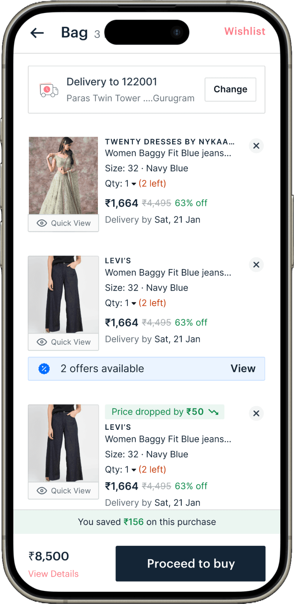
One of those ideas was Quick View, which allowed users to get a quick overview of the product directly on the cart page.
I pitched the idea to the Product Team, and they were on board. We decided to start with an MVP that would convey basic information: product images, brand name, product name, and price.
I quickly created a prototype of Quick View and conducted a round of floor usability testing with actual Nykaa Fashion users from other teams.
Their feedback was encouraging, and it got me excited to move forward with development.
Solution Phase 1
The Quick View feature included a bottom sheet with large images. It was time to implement this small bottom sheet on the Cart Page.

Outcome
After a quick round of Design Quality Check, Quick View was developed and launched for users.
Quick View Phase 1 was adopted, and the data backed it up: abandonment from Cart to PDP dropped from 70% to 55%. Cool, right? Idea validated and experiment successful!
However, with 55% of users still returning to the PDP, it's clear that design thinking isn't linear. So, diving deep into Mixpanel dashboards once more, I aimed to figure out what else they were seeking. After tracking the journey again, I uncovered these insights:
Users were going back to the PDP to zoom in on images, check product details, and view ratings.
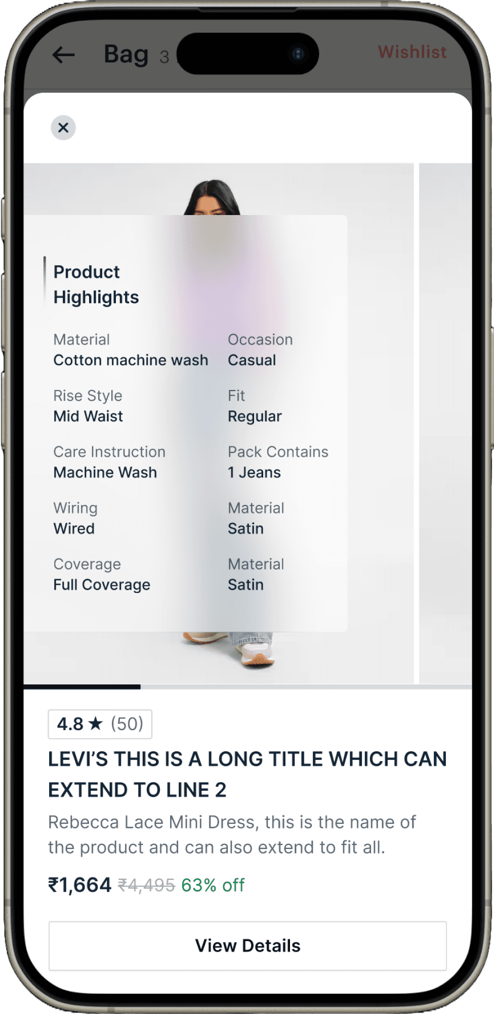
With these insights in mind, I began building on top of the MVP we had launched earlier. This included adding a "Product Highlights" section to Quick View, integrating zoom functionalities, and displaying ratings.
Solution Phase 2
After extensive visual exploration, a Glassmorphic style for the UI was finalized. We got it developed, conducted thorough quality checks, and then went live for our users.
Bam! Within a month, we observed a significant drop in Cart to PDP abandonment—from 70% to 55%, and now down to just 22%. This led to a slight improvement in conversion rates and reduced delays in conversions. Pretty crazy, right?
Quick View became one of the star design initiatives for the Fashion Design Team, earning me appreciation for my use of data and collaboration with PMs and developers.
I then conducted workshops with the team on Mixpanel and how to derive insights from data.
Learning
You don’t always need to make drastic changes to see results; sometimes, addressing low-hanging fruits can have a significant impact.
Design thinking isn’t always a linear process; it's a toolkit of methods and tools that you can adapt. Being mindful of the tools and methods you use is key.


